There are lots of color theories and formulas out there. But what if you have, say a new shirt and you want to make necklace to go with it? And maybe the shirt is a solid color or maybe 2 colors. How do you develop a palette to show it off?
I’ve been going through my stack of home improvement magazines that I’ve amassed and I stumbled across a one page item from a designer talking about picking colors for a room. Basically, you have one key item for that room and that is your focus color, then you have an accent color, 2 neutrals and a “bridge” color that should be a mix of the primary and one of the neutrals. I looked at MY living room and I have an avocado green velvet couch – my key. Then I have a (6 ft high) red velvet chair (my accent) and my walls are 3 different colors of grey. My “bridge” color is my blue/green/grey carpet. Well, my little brain went “Huh! This will work for clay!”
 So I sat down, got out my NCT round cutter and went to work with my beloved Souffle clay. Working outside my normal palette was a must, so I chose Souffle Raspberry for my Key color and Souffle Cornflower as the Accent color.
 Now I needed two neutrals, so I decided that I would pick a warm Neutral (Latte) and a cool Neutral (Concrete).
 Next I needed that Bridge color, so I mixed the warm neutral, Latte 1:1 with the Primary color, Raspberry. (I can’t imagine trying to pick a paint color as a bridge!)
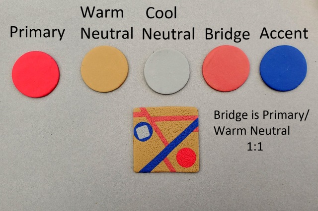
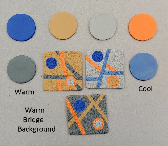
So let’s line up all the colors in this palette. There is our Primary, Warm Neutral, Cool Neutral, (warm) Bridge, and Accent.
I decided to do a little geometric tile to see if the Raspberry would stay the focal point. So first I used the warm Neutral and the warm Bridge color with the Primary and Accent. Yep! that Raspberry circle pops! I included the cool Neutral as a small accent color.
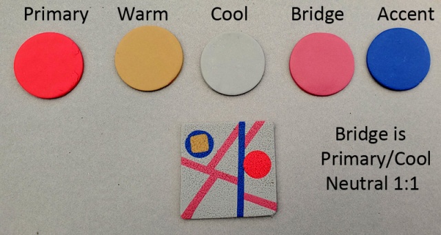
So what about using the Cool Neutral, Concrete to create the Bridge color? Even touching that Cornflower line, the Raspberry still pops.
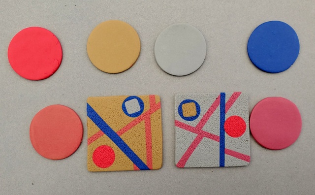
Let’s see them both together with the palette warm on the left and cool on the right:
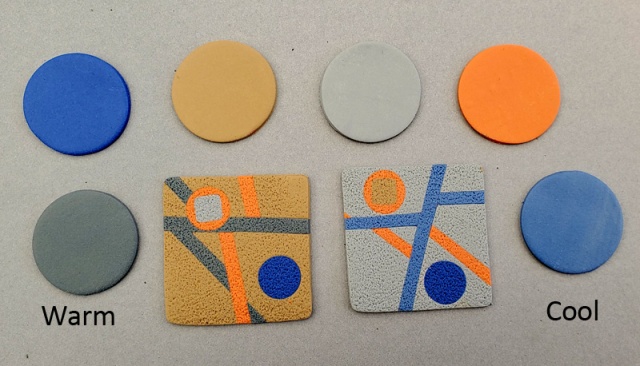
Then I figured, “Hey, let’s reverse the colors and make the Cornflower the Primary and the Raspberry the Accent”. Look what color pops NOW…
So then I had to try a less bold Primary color like Souffle Pumpkin. The Pumpkin is a little too close to the warm neutral for me,but it still pops.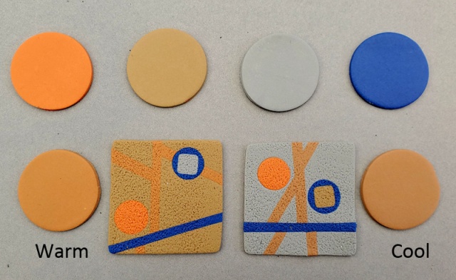
I got tired of the backgrounds, so I swapped the warm Bridge color in to the background and made the warm Neutral one of the line accents. Wow! It’s my favorite..
So, give this a try next time you are setting a color palette!
xoxo, syn


