I decided to do some practical color application and play shape and color.
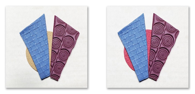
First, imagine my surprise when I mixed Cornflower and Latte and got what looks like Bluestone! It has a tiny bit more saturation than Bluestone. The Cherry Pie/Latte mix was a little washed out (but I kinda wish I had run with it just to see), so I added a bit of Cornflower to it and created a kind of deep purple color that contained BOTH the Cornflower and Latte. The Latte circle in the image on the left ties the colors in well.
The image on the right has the same color mixed top pieces, but I used a circle of straight Cherry Pie. So the top two panels share both Latte and Cornflower, but only the right side shares the Cherry Pie. But for some reason I find this combination really intriguing – the Cornflower panel on the left really stands out.
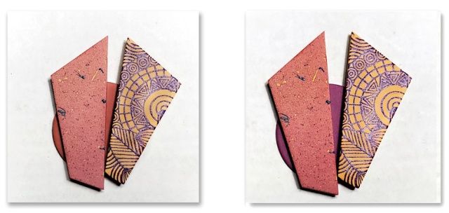
Then I decided to try my colors from NCT this week (because I’m obsessed with them).

Cinnamon as base neutral. Top panels are Guava/Cinnamon 2:1 (with paint spatter) and Canary/Cinnamon 2:1 (with silkscreen).
The image on the left is backed with a Cinnamon circle. This is my favorite, I *think*. It looks warmer and richer to me?
The image on the right is backed with a Grape/Cinnamon 2:1 mix that I also tried to match in both the paint spatter and the silkscreen. (I also added a spatter that was similar to the Canary/Cinnamon mix). I like it as well! But it doesn’t seem as cohesive as the left side to me.
So now I have to solve my dilemma here and pick one set of each of these colors and glue them together if I want to have anything from this exercise to wear! I think I’m going to go with BOTH of the right sides. What would you pick?
xoxo, syn

