I love to play with scrap – it is a opportunity to explore ideas that I don’t really want to gamble my “good” clay on. Most of the time, it works out, but SOMETIMES…well, we have all had THAT experience!
When I mix the New Color Tuesday mixes, I mix the entire month at the same time (that way it is easier for me to remember what colors I’ve already mixed!). I always take the scrap clay mixes and explore with them. Why not? They should all have one thing in common right? The mix color!
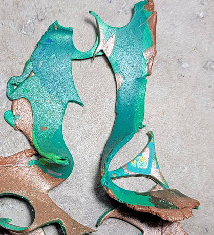
I decided to mix with Sculpey Soufflé™ Shamrock for March – its Spring, St Patrick’s Day AND….a very tricky color to mix with. I had this pile of mostly green scraps and a little of the Sculpey Premo™ Copper that I had used in one of the mixes. So I marbled the clay and voila! I was decidedly underwhelmed with the result.
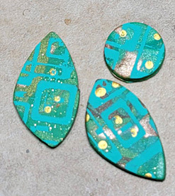
I knew that I needed to make SOMETHING with the sheet of clay for the project, so I decided to silkscreen on the sheet with one of my original design silkscreens. Well, of course, I used my favorite Ocean Breeze turquoise craft paint on the screen. That did NOT help much, the colors were too similar..

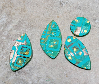
I cut out my pieces using my favorite Sculpey cutter, the Irregular Triangle. (Which by the way, you can create facing pieces by just flipping your clay sheet over and cutting!) And in a leap of faith, I baked them all. You never know right? Paint can notoriously shift colors when baked. NOPE
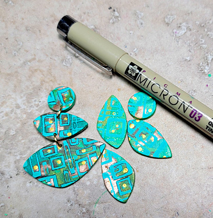
What was I GOING TO DO? I had committed fully to these pieces. But I needed some CONTRAST. Then it hit me, I could try using my trusty 03 Micron Black marker that I use to help fix the tiny gaps (or holidays) in my transfers and try to outline the screened boxes. Straight lines right? I *should* be able to do that. Pep talk time – family of artists, kids can draw so its in the genes SOMEWHERE, relax, breath, do a test piece. Don’t think about having to remix all these colors…

That little pop of black really brought out ALL the different tones and colors in the clay!
I even realized that I didn’t actually have to outline every single element of the silkscreen. Whoa! The 8 year old me was like, “That’s crazy! You need to have them all the same!” But the er, slightly older now, version of me said, “Hey, it’s fun, looks great, LEAVE IT ALONE.
The Adult Me said, “Now let’s show them off immediately (some things NEVER change..)”


